Category:
Product Design
Client:
Barclays via Dare
Duration:
16 weeks
Location:
Bristol, London, Paris
This project sits here as a reference point rather than a highlight, showing where many of the instincts that shape my work today first formed. It captures an early moment where design moved beyond screens and aesthetics into questions of trust, behaviour, and system thinking. Including it provides context for how my approach developed, and why I continue to focus on reducing complexity and building confidence through product design.
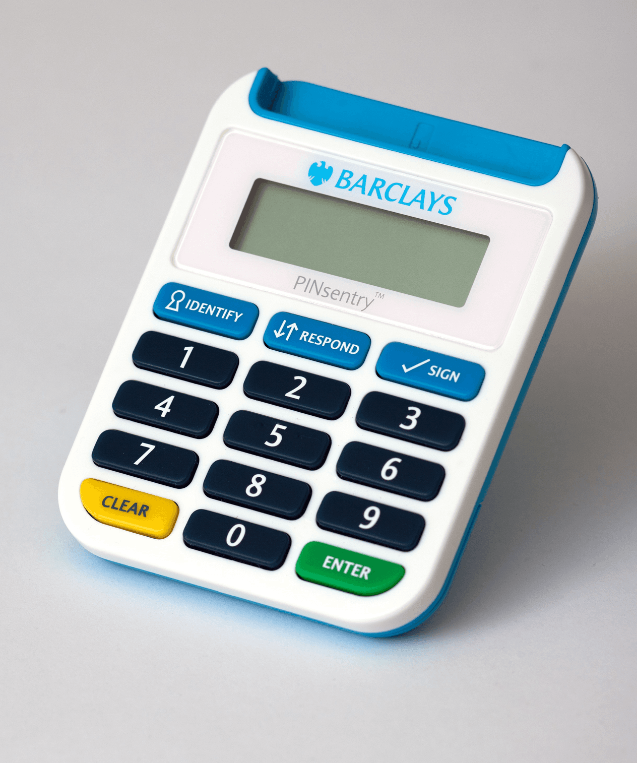
Barclays PINsentry was the first mobile product I worked on professionally, and it arrived at a moment when mobile banking itself was still finding its shape. The physical card reader was familiar, trusted, and widely used, but translating that experience into software introduced a new kind of problem: how do you replace something tangible and secure with something invisible without losing confidence or clarity? Working alongside Barclays and an in-house experience team, the focus quickly moved beyond simply recreating the device on screen. The task became understanding behaviour, expectation, and trust. Through early research and interviews, it became clear that users did not want innovation for its own sake; they wanted reassurance that what replaced the physical device would feel just as reliable, while being easier to access and use in everyday contexts. The project required balancing emerging mobile conventions with an interaction model people already understood, shaping an experience that respected familiarity while quietly moving the product forward.
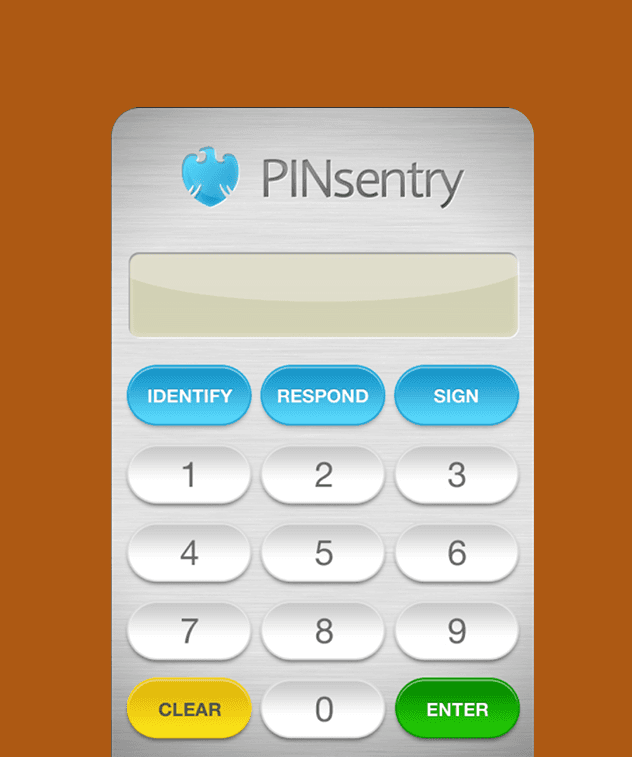
One of the central challenges was visual and interaction direction. At the time, digital products were shifting away from skeuomorphism, yet removing too much physical reference risked making the experience feel abstract and unsafe for a security-critical action. We explored both extremes, from highly literal representations of the device through to more simplified digital interpretations, testing how visual fidelity affected understanding and confidence. The outcome was a considered middle ground: enough physical familiarity to anchor the experience, paired with native mobile behaviours that made the interaction faster and more accessible than the hardware it replaced. Security considerations also shaped many decisions, particularly around how actions were communicated and confirmed, ensuring users always understood what was happening and why. The work reinforced an early lesson that would shape later projects — that design is often less about introducing something new, and more about helping people safely transition from what they already know.

The final product demonstrated that replacing a physical tool with software could increase both usability and accessibility without compromising trust. By aligning expected behaviours with platform conventions, the app reduced friction while maintaining the sense of security users associated with the original device. For me, the project marked the beginning of a long-standing approach to product design: start with real behaviour, reduce uncertainty through testing, and use design to make complex systems feel straightforward. Many of the themes that continue to define my work today were present here in early form — working within constraint, translating complexity into clarity, and using prototyping and iteration to align stakeholders around what should actually be built, rather than what simply could be built.